You manage 20, 50, or 100+ properties. You receive audit reports from each one. But when leadership asks, “What is our compliance position across the portfolio?” you spend hours pulling data from spreadsheets, PDFs, and emails.
The data exists. The visibility does not.
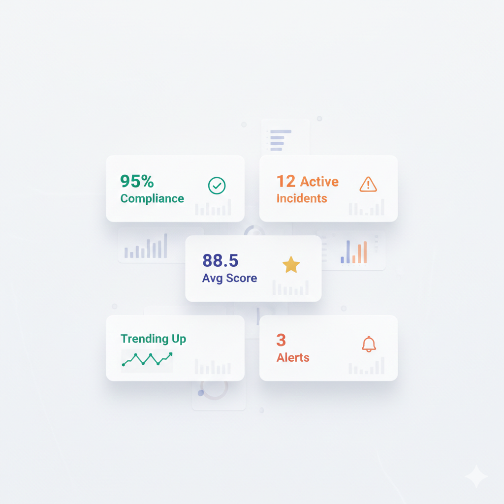
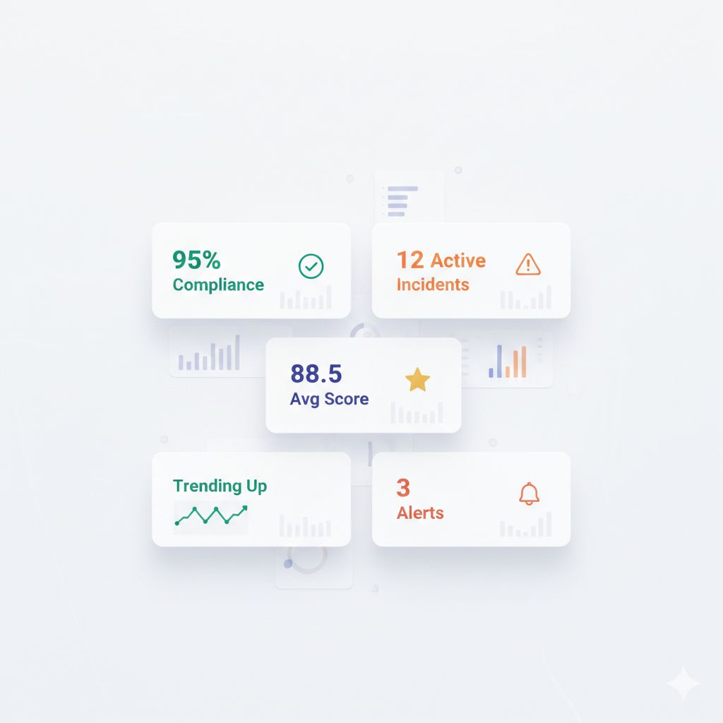
A portfolio audit dashboard transforms scattered data into actionable insight—showing you which properties need attention, where standards are drifting, and whether your compliance investments are paying off.
This article covers the five metrics that matter most for multi-property audit visibility, with guidance on how to build dashboards that drive action.
Why Portfolio-Level Visibility Matters
The Single-Property vs. Portfolio View
| Single-Property View | Portfolio View |
|---|---|
| ”Property A scored 87%" | "87% is below our portfolio average of 91%" |
| "We passed the audit" | "We passed, but 6 properties are at risk of failing" |
| "Housekeeping had 3 findings" | "Housekeeping findings increased 20% across all properties" |
| "We fixed the issues" | "The same issues are appearing at multiple properties” |
Individual property data tells you what happened. Portfolio data tells you what it means.
Common Portfolio Visibility Problems
| Problem | Impact |
|---|---|
| Data in different formats | Cannot aggregate or compare |
| Different scoring systems | Apples-to-oranges comparisons |
| Delayed reporting | By the time you see data, it is outdated |
| No centralized access | Information lives in regional silos |
| Manual compilation | Significant labor to produce reports |
The 5 Essential Portfolio Audit Metrics
Metric #1: Audit Completion Rate
What it measures: The percentage of scheduled audits that were actually completed on time.
| Calculation | Formula |
|---|---|
| Completion Rate | (Completed Audits ÷ Scheduled Audits) × 100 |
Why it matters:
An audit that does not happen cannot find problems. Low completion rates indicate:
- Understaffing at property level
- Competing priorities crowding out compliance work
- Lack of accountability for audit execution
- Potential pencil whipping (audits marked complete but not done)
Target: 95%+ completion rate
Dashboard Display:
| View | Purpose |
|---|---|
| Portfolio average | Overall completion health |
| By property | Identify properties falling behind |
| By audit type | Are certain audits being skipped? |
| Trend over time | Improving or declining? |
Pro Tip from the Floor: Track both completion rate AND on-time completion. 100% completion with 40% late is still a problem—it means issues are discovered later than they should be.
Metric #2: Average Audit Score
What it measures: The mean score across all audits for a given period, property, or category.
| Calculation | Formula |
|---|---|
| Average Score | Sum of All Scores ÷ Number of Audits |
Why it matters:
The average score is your headline compliance indicator. It answers: “On balance, how compliant is this property/region/portfolio?”
Key Comparisons:
| Comparison | Insight |
|---|---|
| Property vs. portfolio average | Is this property above or below peers? |
| Current vs. prior period | Improving or declining? |
| By audit category | Which area needs most attention? |
| By region | Regional performance patterns |
Target: Varies by audit type; set based on brand standards or internal thresholds.
Dashboard Display:
| View | Purpose |
|---|---|
| Portfolio-wide average | Executive summary |
| Quartile distribution | Spread between best and worst |
| Property ranking | Quick identification of outliers |
| Category breakdown | Housekeeping, safety, F&B, etc. |
Caution: Average scores can mask problems. A 90% portfolio average could mean all properties at 90%—or half at 95% and half at 85%. Use distribution views to see the full picture.
Metric #3: Critical Deficiency Count
What it measures: The number of high-severity findings that pose immediate compliance, safety, or brand risk.
| Calculation | Formula |
|---|---|
| Critical Deficiency Rate | Critical Findings ÷ Total Audits |
Why it matters:
Not all deficiencies are equal. A missing guest comment card is not the same as a blocked fire exit. Critical deficiency tracking ensures that high-impact issues receive immediate attention.
Examples of Critical Deficiencies:
| Category | Examples |
|---|---|
| Life safety | Blocked exits, missing extinguishers, non-functional alarms |
| Health | Temperature abuse, pest evidence, sanitation failures |
| Brand | Logo/signage violations, critical collateral missing |
| Legal | ADA violations, expired licenses, missing certifications |
Target: Zero open critical deficiencies beyond 24-48 hours.
Dashboard Display:
| View | Purpose |
|---|---|
| Total critical open now | Current exposure |
| By property | Where is the risk concentrated? |
| By category | What type of critical issues predominate? |
| Time to resolution | How quickly are criticals being closed? |
Pro Tip from the Floor: Critical deficiencies should trigger immediate alerts—not appear only on monthly dashboards. By the time you see it in a report, it may have already caused a problem.
Metric #4: Corrective Action Closure Rate
What it measures: The percentage of identified deficiencies that have been resolved within their target timeframe.
| Calculation | Formula |
|---|---|
| Closure Rate | (Closed on Time ÷ Total Assigned) × 100 |
Why it matters:
Finding problems is pointless if you do not fix them. Closure rate measures whether the audit program is actually driving improvement or just generating paperwork.
Key Distinctions:
| Metric | Meaning |
|---|---|
| Closure rate | Percentage closed within target time |
| Overdue actions | Number/percentage still open past due date |
| Average time to close | How long issues typically take to resolve |
| Repeat findings | Same issue found again after “closure” |
Target: 90%+ on-time closure rate.
Dashboard Display:
| View | Purpose |
|---|---|
| Portfolio closure rate | Overall follow-through health |
| By property | Who is closing actions, who is not |
| By category | Are certain issues harder to close? |
| Aging report | How old are open items? |
| Repeat findings | Are “closed” issues really fixed? |
Warning Signs:
| Pattern | Likely Cause |
|---|---|
| Low closure rate everywhere | Unrealistic timelines, lack of accountability |
| Low closure rate at specific properties | Local management capacity issues |
| Low closure in specific categories | Resource constraints (e.g., maintenance backlog) |
| High repeat finding rate | Fixes not addressing root cause |
Metric #5: Trend Direction
What it measures: Whether compliance metrics are improving, stable, or declining over time.
| Calculation | Formula |
|---|---|
| Trend | Compare current period to prior period(s) |
Why it matters:
A single snapshot tells you where you are. Trend analysis tells you where you are headed—and whether your improvement initiatives are working.
What to Trend:
| Metric | Question Answered |
|---|---|
| Average scores over time | Are we getting better or worse? |
| Completion rates over time | Is audit discipline improving? |
| Critical deficiency count over time | Is risk exposure decreasing? |
| Closure rates over time | Is follow-through improving? |
| Specific deficiency types over time | Are problem areas being addressed? |
Dashboard Display:
| View | Purpose |
|---|---|
| Line chart (12 months) | Visualize trajectory |
| Month-over-month change | Recent direction |
| Year-over-year comparison | Seasonal adjustment |
| Forecasted trajectory | Where will we be if trends continue? |
Pro Tip from the Floor: Do not obsess over month-to-month fluctuations. Look for sustained trends over 3-6 months. A single bad month is noise; three consecutive declining months is a signal.
Building an Effective Dashboard
Hierarchy of Views
Structure your dashboard for different audiences:
| Level | Audience | Focus |
|---|---|---|
| Executive | C-suite, owners | Portfolio summary, risk exposure, trend |
| Regional | Regional directors | Regional comparison, outlier properties |
| Property | GMs, department heads | Property detail, action items, category breakdown |
Dashboard Design Principles
| Principle | Application |
|---|---|
| Start with the question | What decision will this data inform? |
| Highlight exceptions | Make outliers obvious |
| Enable drill-down | Summary → detail path |
| Show trends | Current value + direction |
| Use consistent scales | Apples-to-apples comparison |
| Update in real-time | Stale data = wrong decisions |
Visual Elements
| Data Type | Best Visualization |
|---|---|
| Portfolio summary | Scorecards with trend arrows |
| Property comparison | Ranked bar charts |
| Distribution | Histogram or box plot |
| Trends | Line charts |
| Categories | Stacked bars or pie charts |
| Geographic | Heat maps |
Common Dashboard Mistakes
Mistake #1: Too Many Metrics
| Problem | Solution |
|---|---|
| 50 KPIs on one screen | Focus on the 5 that matter most |
| Dashboard requires scrolling | Key insights above the fold |
| Users do not know where to look | Hierarchy and visual priority |
Mistake #2: Vanity Metrics
| Vanity Metric | Actionable Alternative |
|---|---|
| ”Total audits completed” | Completion rate (% on time) |
| “Total findings” | Findings per audit (normalized) |
| “We did 1,000 inspections” | What did those inspections find? |
Mistake #3: No Context
| Metric Alone | With Context |
|---|---|
| ”Score: 88%" | "88% vs. 92% target, down from 91% last month" |
| "5 critical findings" | "5 critical = highest in 6 months" |
| "90% closure rate" | "90% on-time, 10% overdue, 3 over 30 days” |
Mistake #4: Static Reports
| Static | Dynamic |
|---|---|
| PDF emailed monthly | Live dashboard, updated in real-time |
| Single snapshot | Drill-down to property/category detail |
| Backward-looking only | Include trend and forecast |
Implementing Portfolio Dashboards
Step 1: Standardize Data Collection
Before you can aggregate data, it must be consistent:
| Element | Standardization |
|---|---|
| Scoring system | Same scale across all properties |
| Audit templates | Consistent questions and categories |
| Severity definitions | Agreed criteria for “critical” vs. “minor” |
| Timing | Same frequency and scheduling approach |
| Terminology | Glossary of terms everyone uses |
Step 2: Centralize Data Storage
| Approach | Consideration |
|---|---|
| Spreadsheet aggregation | Manual, error-prone, limited scale |
| Shared drive/email | Better, but still requires manual compilation |
| Centralized platform | Automated aggregation, real-time updates |
Step 3: Define Thresholds and Alerts
| Metric | Threshold | Alert |
|---|---|---|
| Audit score | Below 85% | Notify regional director |
| Critical deficiency | Any | Immediate notification to GM |
| Overdue action | 7+ days past due | Escalation to regional |
| Completion rate | Below 90% | Weekly report to ops director |
Step 4: Assign Ownership
| Responsibility | Owner |
|---|---|
| Data accuracy | Property-level audit owners |
| Dashboard review | Regional directors (weekly) |
| Action follow-up | GMs (ongoing) |
| Trend analysis | Operations leadership (monthly) |
Step 5: Drive Action
A dashboard that is viewed but not acted upon is worthless.
| Practice | Cadence |
|---|---|
| Weekly dashboard review | Regional calls |
| Monthly trend analysis | Ops leadership meeting |
| Quarterly deep dive | Strategic planning |
| Immediate alert response | As triggered |
Key Takeaways
- Five metrics matter most: Completion rate, average score, critical deficiencies, closure rate, trend direction
- Context is essential: A number without comparison is meaningless
- Dashboards must drive action: If data does not lead to decisions, it is wasted effort
- Standardization enables aggregation: Inconsistent data cannot be compared
- Real-time beats static: Monthly PDF reports are already outdated when received
- Exceptions should be obvious: Design for outlier identification
What to Do Next
- Audit your current visibility — Can you answer “portfolio compliance status” in 5 minutes?
- Identify data gaps — What metrics are missing or inconsistent?
- Standardize templates — Ensure all properties use the same scoring approach
- Prioritize the 5 metrics — Start with the essentials before expanding
- Define alert thresholds — What levels trigger action?
For a multi-property audit platform with real-time portfolio dashboards, automatic roll-up reporting, and alert-driven exception management, schedule a demo →
Related Reading
- How to Build a Centralized Audit Framework for 50+ Properties
- Why Audit Scores Vary 20% Across Properties
- Benchmarking Properties: Apples-to-Apples Comparison
- The Multi-Property Standards Drift Problem
HAS provides real-time portfolio dashboards with property-level drill-down, exception alerts, and trend visualization. See your entire portfolio in one view. Schedule a demo →

About the Author
Orvia Team
Hotel Audit Experts
The Orvia team brings decades of combined experience in hospitality operations, quality assurance, and technology. We're passionate about helping hotels maintain exceptional standards.